When you’re designing your Wix website, it’s easy to make a few common mistakes that can hinder its effectiveness. You might find yourself overwhelmed by cluttered layouts, poor navigation, or inconsistent branding, which can confuse visitors and weaken your message. Addressing these issues is crucial for enhancing user experience and engagement. But what are the specific fixes you can implement to elevate your site? Keep exploring to uncover some practical solutions that can transform your wix website design into a more streamlined and effective platform.
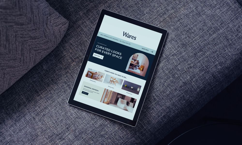
Cluttered Layouts
When you’re designing your Wix website, it’s crucial to avoid cluttered layouts that can overwhelm visitors. A cluttered design makes it hard for users to focus on your key messages or navigate your content effectively. To create a visually appealing site, think about the balance between text, images, and white space.
Start by prioritizing your content. Identify the most important information and highlight it, using larger fonts or bold colors. This helps guide the visitor’s eye to what matters most. Make sure you use clear headings and subheadings to break up text and create a logical flow.
Less is often more. Resist the urge to fill every space with elements; instead, leave room for breathing. Use consistent spacing and alignment to create a harmonious look. Choosing a limited color palette can also help keep your design cohesive.
Finally, test your layout on different devices. A design that looks good on a desktop mightn’t translate well to mobile. By streamlining your layout, you’ll enhance user experience and keep visitors engaged longer, ultimately driving better results for your website.
Poor Navigation
A cluttered layout can often lead to poor navigation, making it difficult for visitors to find what they need. If your website’s menu is overloaded with options or lacks clear labels, users might feel overwhelmed and leave in search of a more user-friendly site. Simplifying your navigation can enhance the overall user experience.
Start by organizing your menu into categories that make sense. Limit the number of top-level menu items to around five or six, and use submenus for additional options. This way, visitors can quickly identify where to go without sifting through endless links.
Also, consider using descriptive labels that clearly convey what users will find when they click. Avoid jargon or vague terms that might confuse your audience.
Additionally, ensure that your navigation is consistent across all pages. Users should easily find the same menu structure regardless of where they’re on your site.
Don’t forget to include a search bar, as it can be a lifesaver for users looking for specific content.
Inconsistent Branding
Inconsistent branding can confuse your audience and dilute your message. When your website features mismatched colors, fonts, and images, it creates a disjointed experience that can turn visitors away. You want your brand to resonate and be easily recognizable, so aim for uniformity across all your design elements.
First, establish a clear brand palette that reflects your identity. Choose a set of primary and secondary colors, and stick to them throughout your site.
Next, select a couple of fonts that complement each other and use them consistently for headings, body text, and calls to action. This not only enhances readability but also reinforces your brand’s personality.
Images also play a significant role in branding. Use high-quality visuals that align with your message and tone. If you’re using stock photos, ensure they match in style and mood.
Finally, create a brand guideline document. Outline your color schemes, fonts, and imagery styles to maintain consistency across your website and any future marketing materials.
Ignoring Mobile Optimization
Ignoring mobile optimization can severely impact your website’s effectiveness. With more users accessing the internet via smartphones and tablets, a mobile-friendly design is no longer optional; it’s essential.
When your site isn’t optimized for mobile, visitors may struggle to navigate, read content, or access important features. This frustration often leads to high bounce rates and lost opportunities.
To ensure your site looks great on all devices, start by using Wix’s mobile editor. This tool allows you to customize the mobile version of your site separately from the desktop version.
Make sure your text is legible, buttons are easily clickable, and images are appropriately sized. Also, check that your layout adapts smoothly to different screen sizes.
A responsive design not only improves user experience but also boosts your SEO rankings, as search engines favor mobile-friendly sites.
Don’t forget to test your site on various devices and platforms to see how it performs. If something looks off, make adjustments.
Slow Loading Times
Website speed plays a crucial role in user experience and retention. If your Wix site takes too long to load, visitors are likely to bounce before they even see what you offer. Fortunately, there are several ways to boost your site’s loading times.
First, optimize your images. Large, uncompressed images can significantly slow your site down. Use tools to compress images without losing quality. Also, consider using the right file formats—JPEGs for photos and PNGs for graphics with fewer colors.
Next, limit the use of heavy animations and videos. While these elements can enhance your site’s appeal, too many can hinder loading speeds. Stick to essential animations and ensure videos load only when the user interacts with them.
Finally, regularly check your site’s performance using tools like Google PageSpeed Insights. This will help you identify specific areas needing improvement.
Overuse of Fonts
Your site’s typography choices can greatly influence its overall aesthetic and readability. When you overuse fonts, it can lead to a chaotic and unprofessional appearance. Stick to a maximum of two or three complementary fonts throughout your site. This helps maintain a cohesive look and ensures your content remains easy to read.
Mixing too many styles can distract your visitors, making it difficult for them to focus on your message. For instance, using a bold font for headings, a clean sans-serif for body text, and perhaps a decorative font for accents can work well. However, if you start adding more font styles, you risk overwhelming your audience.
Another crucial element to consider is font sizes. Ensure they’re consistent across different sections to avoid confusion. A clear hierarchy in your text helps guide readers through your content, making it more enjoyable and digestible.
Lastly, always test your chosen fonts on various devices. What looks good on a desktop might appear cluttered on a mobile screen. By being mindful of your font choices, you’ll create a polished and user-friendly experience that keeps visitors engaged.
Lack of Visual Hierarchy
When typography is inconsistent, it often leads to a lack of visual hierarchy that can confuse visitors. You want your website to guide users through the content effortlessly, and without a clear structure, they may struggle to find what they need.
Visual hierarchy involves using size, color, and placement to emphasize important information. If you use different font sizes and styles randomly, your message gets lost in the chaos.
To fix this, start by choosing a few complementary fonts and stick to them throughout your site. Define heading levels, making sure that each one stands out distinctly. For instance, use a larger font size for H1 headings and progressively smaller sizes for H2 and H3. This creates a clear path for users to follow.
In addition, consider color contrast. Use bold colors for calls to action or key information, while softer tones can highlight secondary content.
Also, don’t forget about white space; it enhances readability and allows users to breathe, preventing overwhelming clutter. By establishing a solid visual hierarchy, you’ll help visitors navigate your site easily, increasing the likelihood they’ll engage with your content.
Missing Call-to-Actions
A clear call-to-action (CTA) is like a signpost guiding visitors toward the next step you want them to take. If your website is missing effective CTAs, you’re likely losing potential customers who don’t know what to do next.
Whether you want them to sign up for a newsletter, download a resource, or make a purchase, a well-placed CTA can make all the difference.
Start by identifying the primary action you want your visitors to take. Once you’ve pinpointed that, design eye-catching buttons or links that stand out from the rest of your content.
Use action-oriented language like “Get Started,” “Sign Up Now,” or “Shop Today” to motivate users to click.
Position your CTAs strategically throughout your site. They should appear above the fold, in the middle of your content, and at the end of key pages.
Don’t overload your site with CTAs, though; too many can overwhelm visitors. Instead, focus on a few key actions that align with your business goals.
Ineffective Image Use
Missing effective CTAs can lead to confusion, but another common pitfall is ineffective image use. Your website’s visuals should enhance your message, not distract from it. Using low-quality images can make your site look unprofessional, so always opt for high-resolution visuals that align with your brand.
Additionally, avoid cluttering your pages with too many images. Too much visual noise can overwhelm your visitors, causing them to miss important information. Instead, choose a few impactful images that support your content and guide the viewer’s eye where you want it to go.
Remember to consider the relevance of your images. They should complement your text and resonate with your audience. If an image doesn’t add value or context, it’s better to leave it out.
Lastly, pay attention to image placement. Strategic positioning can draw attention to key elements of your site, like CTAs or important information. Use images to create a visual hierarchy, leading your visitors through your site in a way that feels natural and engaging.
Fixing these image-related issues can significantly enhance your overall website design.
Neglecting SEO Basics
Your website’s visibility hinges on effective SEO practices, and neglecting these basics can severely limit your reach. If you want potential customers to find you, you need to optimize your Wix site for search engines.
Start with keyword research—identify the terms your audience is searching for and integrate them naturally into your content.
Don’t forget about title tags and meta descriptions; these elements are crucial for telling search engines what your pages are about. In Wix, you can easily edit these under the SEO settings for each page.
Ensure your URLs are clean and descriptive, as this helps both users and search engines understand your site structure.
Image optimization is another key aspect; use relevant file names and alt text to boost your site’s SEO.
Be mindful of loading speeds as well. A slow site can hurt your rankings, so compress images and minimize unnecessary scripts.
Lastly, consider mobile optimization. With most users browsing on their phones, having a responsive design is essential for keeping visitors on your site.
Conclusion
To create a successful Wix website, it’s crucial to avoid common design mistakes. By prioritizing a clean layout, improving navigation, and ensuring consistent branding, you’ll enhance user experience. Don’t overlook mobile optimization and loading speeds, as these directly impact engagement. Additionally, incorporate clear call-to-actions and effective visuals while keeping SEO in mind. By addressing these issues, you’ll create a more appealing and functional website that resonates with your audience and drives results.